Wednesday 2 April 2014
Tuesday 1 April 2014
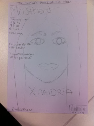
Final Draft
The use of drafts has allowed me too look at how I have improved my magazine along the way. I'm able to look at my other drafts and see what I have done to make my magazine look better and note what changes I can make on my recent draft to make my Final Magazine look as professional as possible.
Thursday 6 March 2014
Friday 21 February 2014
Using Photoshop
This week I looked at different ways to make the photos I took
much better to look at. The images I took seemed to look darker than what they
were supposed to look like, I knew I’d have to change this if I wanted to make
my magazine look more professional. To make the images better I went on Photoshop
and used the brightness/contrast to make the image lighter. Using the level
also allowed me to adjust the brightness and how much of the shadow I wanted to
add. For the main image I took away part of the background as it didn’t go well
with the white background theme I was intending on having for my magazine.
Tuesday 18 February 2014
social media
This week I looked at what social media websites I could
include in my magazine. I looked at what would interest my target audience. Because
my magazine is as music magazine I looked at what websites are music based. I thought
of using: spotify, soundcloud and youtube. I looked at what social media my
target audience would be interested in and I thought of having my magazine have
a facebook page and twitter page. This would be a faster way for my target
audience to get information about the magazine and what’s going to be on the
next month’s issue. This would be an effective way to update the readers on the
magazine as they tend to be on the internet often and looking up what’s
relevant on their social media websites.
Monday 10 February 2014
Photoshop
This is footage showing how I was able to enhance my images using Photoshop before I added them to my magazine on Indesign. Taking a video of how I was able
to make my images better shows how my skills have developed since I started
Foundation Portfolio.
Tuesday 4 February 2014
Sketches

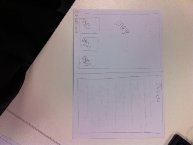

Having these sketches enabled me to visualise how I wanted
my magazine to look and how I wanted the layout to look. By doing sketches it
meant that I had planned ahead, which in turn meant that my magazine would look
more professional as I had thought things through when considering what my
target audience would like.
Saturday 1 February 2014
Outdoor Photoshoot
I took my model to London in order for me to get a wider
variety of photos. Looking at last year’s media students I noticed that the
majority of them used pictures outside the studio. To make my magazine more
effective and attractive I decided to do the same. I took my model to a skate
park in London which wasn’t too far from the London eye. The skatepark linked
to my target audience as they are the type of audience that like to skateboard
and are hipsters, meaning they would find the images interesting to look at. The
images turned out well as I got my model to dress how my target audience would.
The surroundings were interesting as there was graffiti on the walls on the
background which made the images more interesting. The images I took are the
majority of images that are on my magazine. All the pictures on my contents
page are from the outdoor shoot; this makes the contents page more colourful and
interesting to look at.
Tuesday 21 January 2014
Behind The Scenes


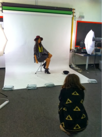


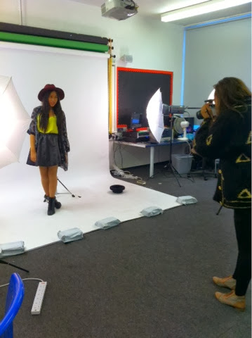
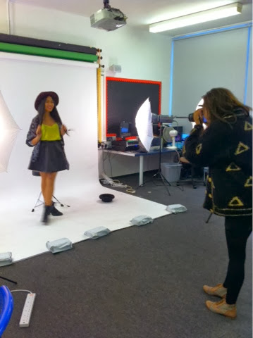

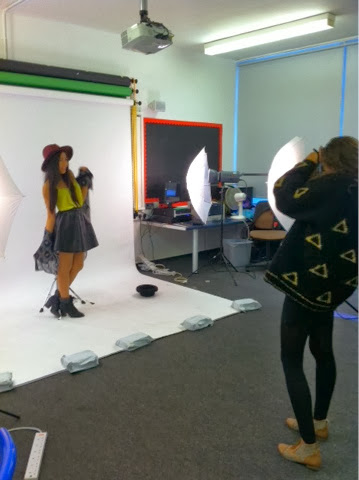

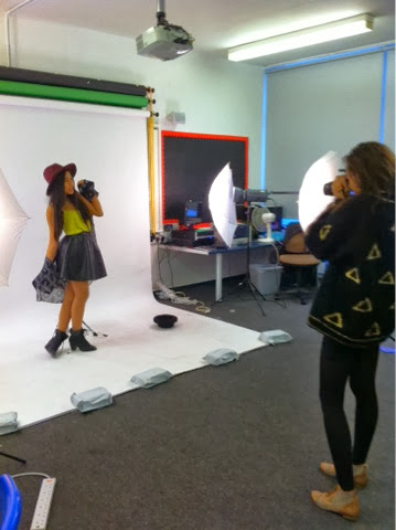
Images from behind the scenes proves that I was the images
that went into my magazine were taken by me. This in addition reminds me of the
layout of the studio in case I had to shoot more photos or needed to re-shoot. With behind the scenes I am able to look at the process I went
through in order to carry out my photo-shoot.
Monday 20 January 2014
Contact Sheet
A contact sheet puts all the photos I took in my indoor photo-shoot
into one document. This allowed me to choose the images I was thinking about
using in my magazine easily as I was able to look at more than one image at the
same time. Due to the fact that I took more than 100 photos this made it easier
for me to eliminate photos I didn’t want to use and made my work process more efficient.
Monday 6 January 2014
Question Seven
Looking back at you preliminary task, what do you feel you have learnt in the progress from it to the full product?
Starting Foundation Portfolio we had to create a magazine
for our school. The magazine had to consist of a front page and a contents
page. There is a vast difference between the school magazine and the magazine I
created as part of my foundation portfolio.
We were able to go round the school and take pictures.
Unlike my actual magazine, I didn’t plan what photos I was planning to shoot
and did it all in the space of a single lesson. My model was dressed in her own
clothes due to the lack of planning and therefore didn’t attract or appeal to a
specific audience. Not many images were used and all the images taken were
taken by phone making the magazine not look professional due to the lack of
technological advanced cameras. This was different to the shoot I did for my
magazine. The shoot was planned in terms of the fact that I had researched
various aspects I wanted to incorporate into the pictures such as outfits,
poses, props for mise en scene and locations. I had also booked a studio in
advance of the shoot. I took careful consideration of my audience whilst
deciding the location, outfits, makeup and location. I took about 400 images
for both my indoor and outdoor photoshoots. This allowed me to have a wide
variety of images to choose from when deciding what images would go best on
what page. With planning my photoshoots in advance I was able to think about
what locations to use. I chose to go to a skatepark to best suit my target
audience which I was unable to do in my preliminary task.
I created the school magazine on Photoshop, whereas I
created the music magazine on Indesign. Regardless of Indesign being a new
software for me to use, I found it fairly simple to get how it worked. With the
help on Indesign I was able to create realistic/professional magazine. I was
able to do this by using the tools available on Indesign such as the guideline
tool and placeholders for when I knew where I wanted an image to go but I
hadn't chosen picked one yet. I was also able to create double pages and found
that it was easier to text wrap and add images. Even though Photoshop can be
used to create magazines, I found that it was easier to use Indesign as it was
more professional and had the tools I needed to create an effective realistic
magazine. Through the use of this software I in turn broadened my knowledge and
skills when I came to media software. In addition, I saw it easier to use Photoshop
for editing images that I wanted to place in Indesign as Indesign wasn’t the
right software for editing images.
Although I had knowledge of Photoshop I hadn’t experimented
with Photoshop in terms of making a magazine, hence why the preliminary
magazine looked simple. I attempted to follow the same house style Haydon
school carries out which is; blue, yellow and white. In comparison to my actual
magazine a vast difference can be noticed. I was careful when choosing a house
style as it had to be colours my target audience would find visually
attractive. I used a font website to
look for an interesting font for my masthead.
I've improved my
skills whilst making the magazine. I've been able to experiment with styles in
order to make my product appealing to its target audience which I would say it
did.
Question Six
What have you learnt about technologies from the process of constructing the product?
When doing my photo shoot I used the Canon
EOS 550D camera to take the pictures of my model Xandria; this is the camera I
used in the magazine i made for my GCSE and my preliminary task so i had experience
with using the camera, meaning id make a few mistakes when taking the pictures.
Using this camera allowed me to take images of good quality that looked
professional. i was able to take many images which allowed to choose from a
vast variety of images in order for me to find the right images to place in my final
magazine. I used a white backdrop during the shoot; this allowed me to easily
crop my model and edit her out of the background. There was professional lighting
used in the studio which produced outstanding pictures. Trigger lighting was
used, this means that whenever in image was taken, the lighting would flash meaning
the images came out clear.
I’ve learnt to use different types of technologies that all together made my magazine look more professional. Using the Canon EOS 550D allowed me to take pictures that looked professional, together with the lighting it made for a more proficient look as whenever I took a picture the lighting would flash at the same time; ensuring the image would be as clear as possible.
I uploaded all the images onto my home drive which allowed me to sort through my images and choose the images I would use for my magazine. When I chose the specific images I wanted to use I started to edit them in Photoshop CS5. The software allowed me to airbrush images, edit the lighting, cut the images and modify the images. I used Photoshop to edit my images to make the images look more professional, the mail reason was to crop the model out of the background from the images that were taken in a studio.
I used Adobe InDesign to create the magazine itself. The software allowed me to use different types of techniques used by professional such as: text wrapping, swatches; allows me to save colours I’ve already used in my magazine, it allows you to drag text when there’s too much text for the page to attain, it also allows you to view double pages side to side so you could view how the magazine would look like when it was finished.
Question Five
How did you attract/address you audience?
My magazine includes the type of language
that is expected to be used from my target audience (provocative and use of
swear words). My magazine provides provocative images where the artist does
unconventional poses to interest the readers and give them a different point of
view. Different types of social media such as; twitter facebook, soundcloud,
blogger, a TV channel, radio, spotify, instagram, keek, vine etc. My magazine website
will be able to be accessed on cell phones, tablets, laptops and computers;
this means that the readers can access the website anywhere they are e.g.
trains, in the car in order to keep up to date with the latest news on the
magazine.
The Uses and Gratifications theory allows
me to get an idea of what my magazine needs to satisfy my audience’s needs and
helps with mass comminication, as it provides an approach that is
audience-centered. My magazine will allow the audience to write to the magazine
so they feel as though they are part of something, using blogs and social media
will help do so too. The colour scheme is inviting to the audience as it’s not
too vibrant or too dull, using colours such as red, black, white, grey and burgundy
brings an alternative look to the magazine.
Subscribe to:
Posts (Atom)