This week I looked at different ways to make the photos I took
much better to look at. The images I took seemed to look darker than what they
were supposed to look like, I knew I’d have to change this if I wanted to make
my magazine look more professional. To make the images better I went on Photoshop
and used the brightness/contrast to make the image lighter. Using the level
also allowed me to adjust the brightness and how much of the shadow I wanted to
add. For the main image I took away part of the background as it didn’t go well
with the white background theme I was intending on having for my magazine.
Friday 21 February 2014
Tuesday 18 February 2014
social media
This week I looked at what social media websites I could
include in my magazine. I looked at what would interest my target audience. Because
my magazine is as music magazine I looked at what websites are music based. I thought
of using: spotify, soundcloud and youtube. I looked at what social media my
target audience would be interested in and I thought of having my magazine have
a facebook page and twitter page. This would be a faster way for my target
audience to get information about the magazine and what’s going to be on the
next month’s issue. This would be an effective way to update the readers on the
magazine as they tend to be on the internet often and looking up what’s
relevant on their social media websites.
Monday 10 February 2014
Photoshop
This is footage showing how I was able to enhance my images using Photoshop before I added them to my magazine on Indesign. Taking a video of how I was able
to make my images better shows how my skills have developed since I started
Foundation Portfolio.
Tuesday 4 February 2014
Sketches
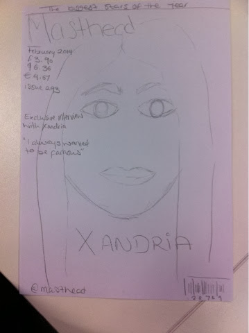

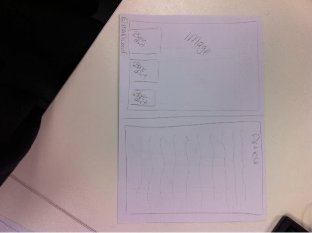

Having these sketches enabled me to visualise how I wanted
my magazine to look and how I wanted the layout to look. By doing sketches it
meant that I had planned ahead, which in turn meant that my magazine would look
more professional as I had thought things through when considering what my
target audience would like.
Saturday 1 February 2014
Outdoor Photoshoot
I took my model to London in order for me to get a wider
variety of photos. Looking at last year’s media students I noticed that the
majority of them used pictures outside the studio. To make my magazine more
effective and attractive I decided to do the same. I took my model to a skate
park in London which wasn’t too far from the London eye. The skatepark linked
to my target audience as they are the type of audience that like to skateboard
and are hipsters, meaning they would find the images interesting to look at. The
images turned out well as I got my model to dress how my target audience would.
The surroundings were interesting as there was graffiti on the walls on the
background which made the images more interesting. The images I took are the
majority of images that are on my magazine. All the pictures on my contents
page are from the outdoor shoot; this makes the contents page more colourful and
interesting to look at.
Subscribe to:
Posts (Atom)