Pages

Monday 30 September 2013

Preliminary Task Evaluation


My front cover is simple, using eye-catching colours such as navy blue and yellow which are also the same colours used on the Haydon stag and the general house style for Haydon. Using a similar house style to the one Haydon uses allows the audience to assume the magazine is related to Haydon. The image I used was full bleed; filling out the page easily. The image is of a girl in a cardboard box attracting the audience as its unusual and not a social norm therefore meaning more people would be intrigued to buy the magazine and see what the article is about. The girl in the image looks directly at the camera giving an effect compelling pacers by to take a second look at the magazine. Having a student on the front cover of the magazine specifies the magazine is for students.

I put in cover lines which followed the colour scheme so my audience identified my magazine and the concept of it being related to the school as the house style is the same has the exact same scheme the school uses around its building, letters and especially on its logo. The sells lines indicate what’s going to be within the magazine. The text I used for the cover lines are simple, this is to not take away the attention from the masthead and the images around the front cover. I used smaller images under the cell lines to show the readers an image of what the article is about, also to make it more visual so the readers will want to flick over to the page.

As the main image I used a teenage girl as my model, she’s in a box; makes clear that the article will be controversial and interesting. The girl looks directly at the camera, giving direct mode of address. Looking directly at the camera attracts the audience to look at the magazine as the eye contact given by the model captivates the reader’s attention. The image is a full bleed image covering the whole front page; the audience is able to see the model’s expression clearly making it a more effective front cover.

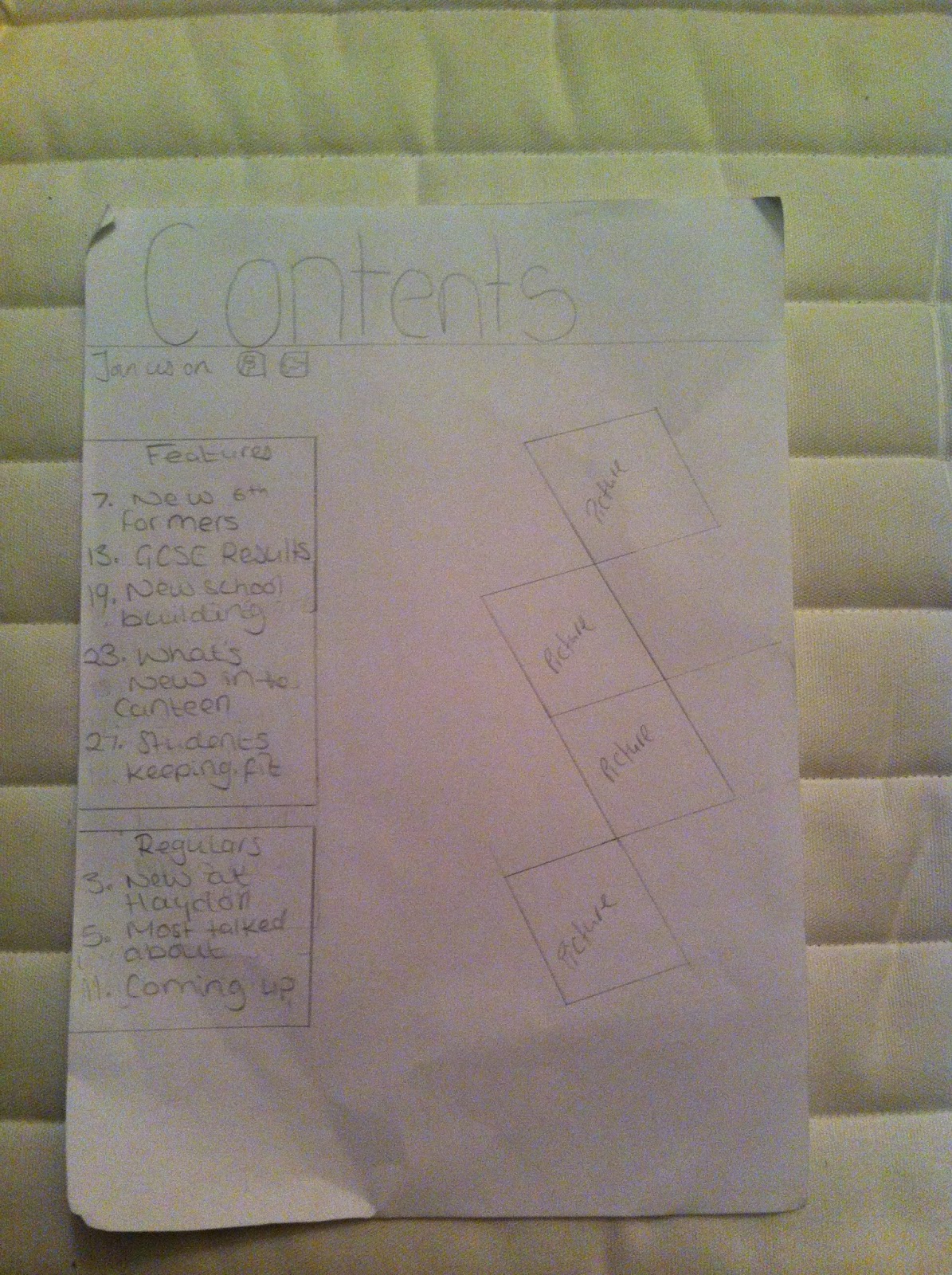
On the contents page I made sure I followed the colour scheme, I keeping a colour scheme consistent in a magazine makes it look professional, and also because it showed that the magazine is linked to Haydon School as the magazine follows the school colour scheme. I used a background colour to make the contents page look more interesting. The colour blue used for the background once again links in with the colour scheme. I included regulars and features; this shows the reader that the magazine is frequent.

I used several types of new media to attract young adults such as; twitter, facebook, youtube and tumblr.

Small images were used to give the readers an idea of what the main articles in the magazine are about.

Thing I could improve:

Ø  Spelling mistake

Ø  Use cover lines and strap lines

Ø  Professional font

Ø  Use images that aren’t blurry

Ø  Don’t make the text too oversized


Preliminary Task Final magazine


Audience Survey


This is the link to the survey i created to get an idea of what the majority of people looked for/wanted when they read a magazine.
 

Sunday 29 September 2013

week 3


This week I looked at several double pages and noticed some similarities. Most magazines use a large image on double pages which I thought connotated that the artist was well known and in the public eye or maybe and icon. Some double page spreads had part of the main image spilling over to the other page; the person/people are more important than the text or denotating that people already knew more than enough about the artist so only little information would be written about the singer/band. Some double page spreads used a certain colour to signify that that particular text was important or used a background on the text. A Drop cap is usually used at the start of some articles to make the article slightly more enticing to read. There’s nearly always a heading which normally informs the reader on what the article is about…usually the heading is in a large font so the person reading the magazine doesn’t have to search hard to find out what the article is about. Double page spreads most likely stick to the house style of the magazine or just used three colours repeatedly to create a house style for that double page which makes the reader feel at ease and allows them to pay attention to the article rather than the distracting amount of colour.

double page

Monday 23 September 2013

Proposal

My magazine will be an alternative music magazine, more alternative rock than anything else. This genre is slowly becoming a big genre in the music industry (up and coming). The colour scheme will relate to the music genre, colours such as red, orange, grey, yellow, maroon.

My magazine will have more images than text because my target audience will be more interested in good photography although I aim to make the text I write quirky and will use a lot of puns.

My magazine will use social media to connect with it's audience. The social media my magazine will use is twitter, vine, Facebook, tumblr, blogger, spotify and soundcloud. Using social media and music media means the readers have other ways to entertain themselves; they wont have to go on any other social media sites keeping them faithful and dedicated to the magazine.

My magazine won’t challenge any magazines but use and borrow the existing conventions, my product will include its own radio station, TV music channel, online based too, blogs, festivals, a shop, tour, own stage at festivals and its own awards.

My product represents particular social groups by featuring certain types of costumes which associate with my music genre. This would help represent a particular social group, as it would be easier for other readers to recognise the target audience/ the genre of my magazine.

IPC Media or BAUER Music will distribute my magazine as they distribute NME and Kerrang which are both well known brands/magazines that are sold worldwide and collect a lot of income from the amount of magazines they sell.


In what ways does your media product use, develop or challenge forms and conventions or real media products?
My media product challenges real media products because of the things it offers. My magazine offers things such as: news, videos, new music, reviews, photos, films and TV shows to watch, blogs, festivals, an online store, radio station, awards, and its own TV station.

My magazine will represent social media as it will concentrate on groups that take media to heart and feel strongly about the music industry and like finding new bands to listen to particularly bands not many people know about. My magazine will represent social groups that like to find something different and not follow what’s on trend; my magazine will do this buy putting new artists in the magazine each month so the audience can keep up to date with new bands.
The audience for my magazine will be 16+ girls and boys who don’t like to listen to conventional music like pop; anything that’s on the charts. They like to listen to bands/artists that aren’t well known. My audience will have a weekend job that pays a minimum of £5 an hour so their able to buy the magazine monthly and pay for their music needs.

I will attract my audience by putting posters, music free bees, music competitions, concert opportunities and id use a colour scheme that would be suitable for my audience, I won’t use girly bright colours like pink but instead somewhat simple. My magazine will include new bands, my magazine will advertise the social media they use and use blogs to make the audience feel part of a community.


contents pages


This week I looked at contents pages and noticed how most magazines are laid out the same as they have regulars, features and images. The regulars are used to creat consistency throughout the magazine The images are used to make the magazine's contents page more ibteresting and appealing to look at. magazines tend to follow the house theme to keep magazine looking regular. there are always page numbers so you find it easier to find the page you're looking for. for my contents page i intend to follow the same rules the magazines i looked at did.

contents page

Monday 16 September 2013

front covers

This week I looked at several magazine front covers to find what an aspect that was used continuously on front cover magazines which was the colours. Most magazines use three colours throughout the magazine, this is a house style. To make an effective front cover magazines use a close-up image or a body shot. Usually when there’s a full image it’s of one person who is most likely well known and can sell magazines instantly by just being on the front covers because they have a big fan base. Most magazines tend to use close-ups as it fills out the front cover. The colours used on front covers are most likely linked to the type of genre the person on the front cover is part of for example if the person made pop music colours like purple, pink, light blue would be used as the main demographic for pop music is young teenage girls; if it were a punk music feature blacks and reds would be used on the front cover. The colours used are also linked to whether or not the magazine is created for a male/female/male and female audience. House styles are vital when creating a magazine front cover as it decides who buys the magazine.

Front Covers

Tuesday 10 September 2013

Preliminary Task Design ideas

 
Front Page
·         I’m going to have a simple masthead called ‘Haydon Weekly’; this allows the readers to recognise that the magazine is associated with Haydon School.
·         I plan on including the Haydon logo; making it easier for the readers to recognise the magazine is associated with Haydon School
·         I’m using the same colour scheme that Haydon uses which is light yellow, navy blue.
·         I’ll include small images to illustrate what other articles are going to be included in the magazine